
Craigslist Mobile App Redesign
Redesign of the mobile version of Craigslist NYC utilizing basic principles and stylistic elements. The mobile version is redesigned considering the interface, information, hierarchy, legibility, and communication of the brand. The brand identity and feel are carried over to the User interface in the redesign in terms of typographic style, primary & secondary colors, and style of visual elements such as buttons, cards, and type fields.
Final prototype
Problem Statement
Craigslist NYC users wanting to post and browse through listings need a way to have a clear hierarchy of information and intuitive navigation in a way that makes them feel at ease in finding and posting listings on the platform.
Design Stages

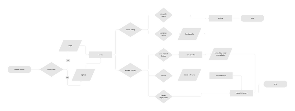
User flow
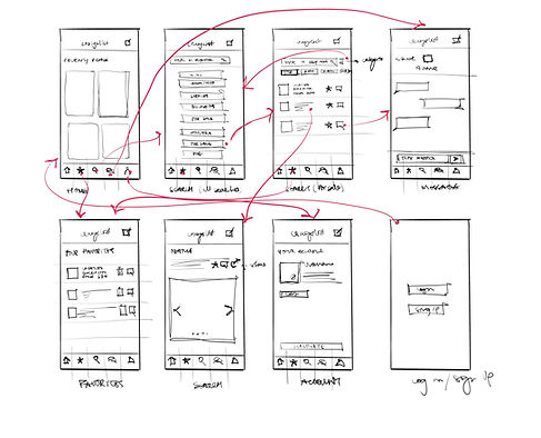
Wireframing
User flow for browsing through listings
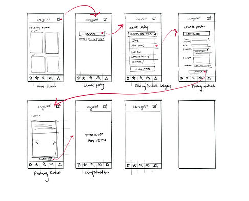
User flow for creating a listing
Wireframing the user flows and sketching the user experience for posting listings and browsing listings through the mobile app.
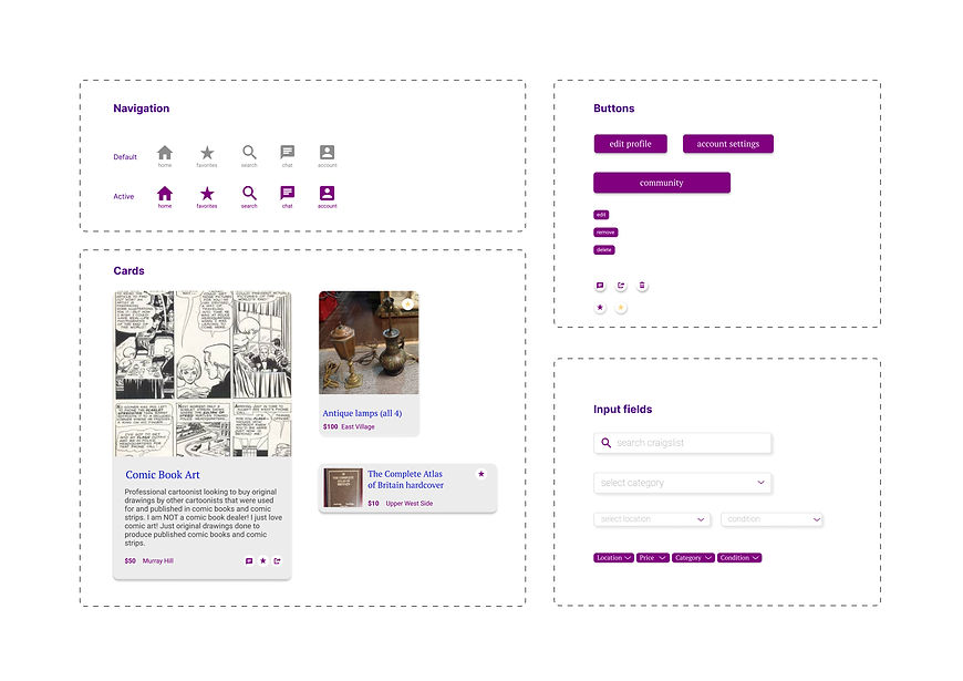
Building the UI Library and Brand systems
Building the UI Library and defining the visual system was the next step. The icons, styles, and typography have been designed and selected in reference to the existing brand identity of Craigslist to carry the essence of the company in the redesign.
Hi-fidelity frames

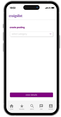
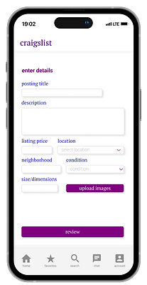
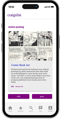
Create postings
Browse listings through navigation to search for postings, contact sellers and favorite postings
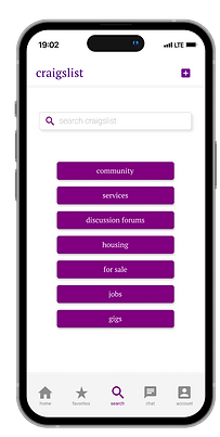
Introducing a home page to create a more simplified user flow for creating and browsing postings. The home page consists of recently viewed postings as well as the starred postings of the user.
Primary navigation consists of starred postings, search, account and messaging, predominantly for the function of browsing through listings.
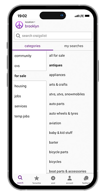

Existing Search screens

Redesigned Search Screens
Changing the information design for the search screens to create a hierarchy and simplifies the process of browsing through listings. The redesigned screens have the same information laid out in a different structure browse and filter through postings in various categories.
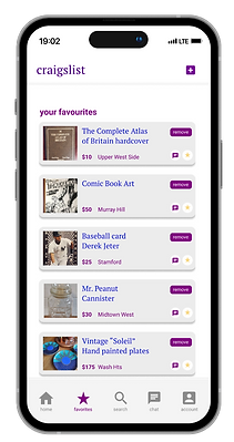
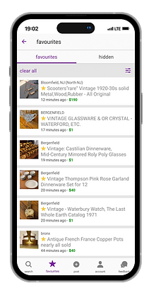
Existing Starred screen
Redesigned Starred listings
Redesigned starred listings screen has the option to remove the listing and message the seller from the list view. The product card is also redesigned to better identify price and location from the list view.

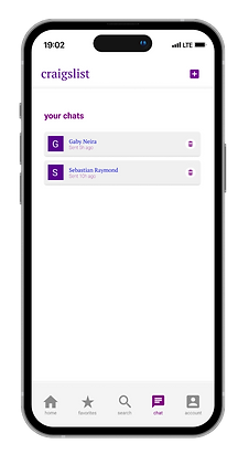
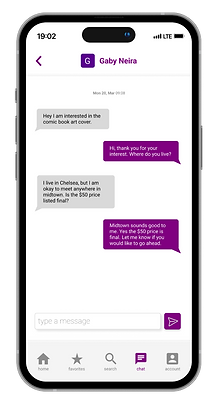
In-app messaging
Accessing the messages from the primary navigation allows the user to keep track of all the ongoing conversations and negotiations with sellers, buyers, employers, etc to increase the ease of locating all the conversations.
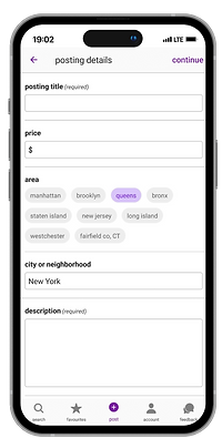
Existing Screens for creating a posting

Redesigned screens for creating posting
Creating a hierarchy in the process of creating postings and redesigning the input fields for a simplified user journey of posting on craigslist.

All screens
Time frame: 6 weeks
Spring 2023 Digital Product Design
Project by: Riya Shah